Inspirations

Inspirations
The color you see is the color you get!

Thursday, January 13, 2011

Flip Flops and Combat Boots

Hi all out there in blog land! I'm Dani Smith. I'm new to the DT, and this is my first post! I just got my paints about a week ago, and I don't think that I've gone one day without playing with them!

Here is a layout I made yesterday when I was playing around in my scraproom:
I used CI Rustic Red on the chipboard heart and the paint splatters. The patterned paper is all Teresa Collins Crush.

I also made an invitation to my son's second birthday party. He turns two in July, but I'm already getting a jump start! :)
I used CI paints to enhance the colors that were already on the patterned paper (which is all Jillibean Soup Monster Stew). I used royal purple on the scallops and on the circles on the monster. And even though you can't really tell from the picture, I used fairy dust on the eyes and teeth and sky blue on the hair.

Thanks for looking and enjoy your Thursday!

Wednesday, January 12, 2011

ink + paint= fun!

Hey everyone! 
I know it isn't my usual day, but you will see me pop in every other Wed. for news and other fun stuff that I'm not allowed to share yet... So stay tuned! 

For today, I thought I would talk a little bit about ink. (yes, I know, this is the Creative Inspirations PAINT blog... but in all reality, ink and paint play very well together.)  I love using ink, and it makes and appearance in some way or another on most every project I do. 

Now I don't have every color of every brand of ink. In fact I really don't have that many brands (though my sister would probably disagree with that...LOL!)  Today I wanted to take a look at my collection of Colorbox inks by Clearsnap. (no, I don't work for them... I just happen to have a fairly good sized collection of their colors...that I got for a specific reason... that I'm not allowed to tell you here yet..)


One of the first things I do when I start collecting a brand of ink is to make a color ring for quick referencing.  Each card has the color name and type on it, and a color sample. This makes it simple to see at a glance what colors I have. It is a great way to play with color combo possibilities as well as find the perfect red ink to match your red paper.

I did the same thing with my CI paints. (And YES, I really do use these visual references a lot!)

Knowing the type of ink you have is also important! Some inks can be painted over with the CI paint, while others are better used as accents in other places. Here is a VERY basic rundown...

Pigment: Thicker, opaque, comes in squishy foam pads. This ink stays wet longer, and is therefor great for heat embossing. They work well with clear stamps.  It DOES NOT play well with water. (in other words, if you stamp your image and try to use CI paints on it, you will end up with a smeared mess!)

Dye: Juicier, more transparent, comes in felt pads. This is a quick drying ink. These inks can sometimes "bead" on the clear stamps leaving a blotchy image. Some dye ink are permanent (or Archival) while others are more water based.. The Archival ones CAN be painted over with no smearing. The  water based ones cannot. (If you are unsure what you have, test it on a scrap paper first!)

Chalk: these are kind of a combination of the other two... They dry quickly like dye inks, but they are thick like the pigment inks.  They are more opaque than dye inks, but not as opaque as pigment. They work well with clear stamps, and they CAN be painted over without smearing. 

Now... we all know how much I like things to match. SO... I have put together a quick reference guide for which Colorbox inks match which Creative Inspirations paints.  I hope you enjoy it. I love how well inks and the CI paints work together and compliment each other!

~Kassi 

(click on the images to enlarge to readable size...)


Tuesday, January 11, 2011

By the Sea

This week the CI challenge is "Inspired by Texture." I must admit that I love using texture in my art, both tactile and visual texture. First, I must say that Creative Inspirations paints are create visual texture for me. The shimmer of the paint on the artwork just makes me want to touch the image.

On this card, the entire image is painted with CI paints. I decided that I was going to stretch myself a little and use several colors that are not my usual first choice. I love all the colors, but by habit I usually reach for certain colors first. This time I used citrus and spring green on the hillside. The flowers are lavender (a gorgeous color I had somehow overlooked before). For the lighthouse I used tan. The sky was done with my oft used sky blue, but I tried a different technique. I used a stipple brush and a torn paper towel to create the sky. I had done that with inks, but never with the paints. I like how it turned out.

For this card I also added texture by layering, embellishments and dry embossing for texture. I used fairy dust on the embossed background. That really added a sparkle--like sitting on the beach watching the waves shimmering in the sunlight. Oh, I'm ready for the snow to disappear and the warmth of summer to be here.

Monday, January 10, 2011

Birthday Cards

We have a ton of birthdays in the month of January, so I have been busy making birthday cards!! 

Here's a few of them I made and of course had to add some of these shimmery paints to them!  These paints add the perfect last touch to a project.

"Birthday Cat w/Balloons"
 A cute Great Impressions Stamp was used to create this card.

I used some fun colors for this birthday card - "Citrus", "Sky Blue" "Tutu Pink", "Pumpkin", "Spring Green" and "Amethyst" to color in the balloons along with using my ProMarkers to do a little shading.


I also used "Sky Blue" on the piece of blue cardstock around the patterned piece of paper to add some more shimmer.
--------------------------------

"Cupcake and Roses"

I added CI Paint "Ivory" to the frosting of this cupcake! Yummy!!  "Fairy Dust" was added to the roses and "Mellow Yellow" was added to the flame on the candle.

--------------------------------


Again I used "Ivory" to coat the frosting on the cupcakes!  "Tutu Pink" was added to her dress, bow and earrings!

I hope you have a great week!!

Sunday, January 9, 2011

CI Paints Inspired By: Textures

Thanks to all that participated in last week's challenge!!  What some beautiful work from everyone!!

Each week you will be given a challenge to find inspiration in/from what ever the challenge theme is... you can be as literal or abstract in your inspiration as you want... Just make sure you can tie it back to the theme!

You will always be able to jump back to the current challenge by clicking the "Current Challenge" link in our sidebar. The rules can always be found by clicking the tab "Challenge Rules" at the top of the page.

You do not need to use the Creative Inspirations Paints in your project, however, if you do, tell us which colors you used, and your name will go in the drawing twice! Each month, one person will win 5 jars of paint in the colors of their choice. The winner will be randomly drawn from all the people who have played that month, so make sure to join in on our challenges each week!

This week's challenge is:
Inspired By: Textures

Here is some inspiration for you:

"Ivory" for the wings, "Coal" for the body, "Fairy Dust" for his yellow stripe and "TuTu Pink" for the heart by the sentiment.


I also added some random circles on the patterned paper.  Then I used "Fairy Dust" to accent them.

Now it's your turn, we're looking forward to seeing what you come up with!

Have a nice day!

Kendra


Saturday, January 8, 2011

endless possibilities...

Hello everyone! Ready to get shimmery?

Today, I thought I would share one of my favorite color mixing techniques. For those of you who know me, I like things to match. When I have a red paper, it bugs me when my red ribbon has just a little too much orange in it. Know what I mean?  Well, the same is true with paint. (yes, I know, Creative Inspirations carries a LOT of colors, but honestly, no one can carry EVERY color!) Anyway, this is a quick and fun way to expand your CI color collection to match your stash. 

You will need:

Creative Inspirations Paint: Fairy Dust
Small container 
mixing stick
Dye Reinkers 
(yes, it must be DYE reinkers.... pigment won't work for this)

Step 1: Place desired amount of Fairy Dust paint in small container. (here I am re-purposing some plastic packaging, however, if you are making a large amount, you can buy small containers with lids for mixing paint at your local Michaels in the paint section)

 Step 2: Add a TINY amount of reinker. A little will go a LONG way, so start small. Here I am using Victorian Velvet Distress Reinker. I don't squeeze the dropper at all.. I just gently tap it to get a tiny drop.

 Step 3: Stir. I use a plastic craft stick, or a toothpick, but you can use whatever you want.

 You now have a custom shimmer paint color to match your ink.

Fairy Dust is the clear shimmer paint from CI. Because of that,  you can see how the pink and green paints match the Victorian Velvet and Forest Moss Distress inks perfectly. *Sigh* I love it when things match!

Want some variation on this same technique?
1. Use Winter Frost paint as your base. This will give you a lighter shade of your color.
2. Use Coal or Onyx paint as your base to give you a darker shade of your color.
3. Use Chocolate or Mocha to give you a muted shade of your color.
4. Use more reinker to give you a deeper, richer color.
5. Try using any other color paint as your base to give you brand new shimmery colors!

The possibilities are endless... I do have to warn you... this can become HIGHLY addicting. LOL!

Friday, January 7, 2011

A little LOVE in January....

 Hello friends!  I am so glad to have you stop by today!  I know it's only January..but, I just can't wait for the Lovin' to begin!  So, I have a sweet love card to share with you that I painted with the Creative Inspirations paints.
The paints I used are Turquoise, Blush and Autumn Wheat.  I love how the shimmer adds to the fun lovin of this card!  I was also inspired by this weeks Inspired by Challenge.  There is still time to play!
Wanna little peek inside??
I hope you have enjoyed the card I created today and maybe it will inspire a few projects for your sweetheart?  
Hugs, JennK

Thursday, January 6, 2011

Yellow Crocus by Holly


My name is Holly and this is my first post as a member of the Creative Inspirations Paints Design Team. I'm very excited to be here with these wonderfully creative ladies!

For my first post, I decided to use a January flower called the crocus. Since I'm not much of a gardener, I had to look up pictures of crocus to see what colors the different varieties can bloom in. There are several yellow ones, so I painted my crocus with the Sunshine CI paint. Don't you just love the shimmer of these paints?? Ahhhhhhhhh....... it makes me smile to see this pretty yellow shimmery flower.

Here is a close-up so you can see the gorgeous shimmer:


Stamps: A Year of Flowers I (Flourishes)
Ink: Tuxedo Black Memento
Cardstock: White, Black
Creative Inspirations Paint: Sunshine
Other: Copic marker, ribbon (Michaels), oval punches (SU), frond punch (Martha Stewart)

Wednesday, January 5, 2011

Bonne Année - Kianel

Hello,
Kianel there with you and i first wanted to wish you all a HAPPY NEW YEAR 2011, may all your wishes come true!
Wanted to share a card with you using the incredibly shimmering paints of Creative Inspirations with a digital stamp:
To colour the image i used a blending of distress inks and the following colors of Creative Inspirations paints "tutu pink" "garnett" "tan" and "fairy dust".
Don't forget to participate on our challenge very sunday!!!
Have a nice day, love from France, Kianel.

Tuesday, January 4, 2011

A new year brings....

Resolutions of course! Most of us make some sort of pledge toward positive change at the beginning of the year. This year my resolution is to regain my happiness, health, and strength. It means I care more about how I am going to feel, than what a number on some scale says. I decided a layout might be my first step in regaining control!


I used Winter Frost paint on the chipboard flourish and journaling block..

So tell me, what are your resolutions? Are you going to scrap them?

Monday, January 3, 2011

ORNAMENTS

HAPPY NEW YEAR Everyone- This is Chris Dickinson and yes, I know Christmas is over. *Smile*  Every year I make ornaments and these are a few that I made this year! I had so much fun making these to add to gifts!


Stamps: I Brake for Stamps Vintage Christmas,
Accessories: Chipboard, Silver ribbon, Aqua painter, Rub Ons, Copic


Stamps: I Brake For Stamps Holiday Squares Accessories: Chipboard, Gem Adhesives, Aquapainter, Dimensionals, White satin Offray ribbon
Creative Inspirations Paint: Lavender, Turquoise, Mango, Pumpkin, Burgundy, Emerald


These paints work so beautifully on chipboard! Thank you for stopping by! I hope you have a FANTASTIC weekend!

Sunday, January 2, 2011

CI Paints Inspired By: Circles

Happy New Year!!

Thank you so much for all who participated in last week's challenge!

I, Kendra, will be taking Kassi's spot by posting this term's challenges as she has some other fun things she will be doing on this blog.  I hope you enjoy the challenges I have chosen each week.  Enjoy and we look forward to seeing what you create!

----------------------------------------------------

It's the first Sunday of the month, which means we have a winner from all of last months entries!!!!

December winner is:

......

PAT MOORE

Congratulations!!
If you can just send us an email with your mailing address, and the 5 colors you would like, we'll get that prize out to you.
ci.shimmer.paint@gmail.com

----------------------------------------------------


Each week you will be given a challenge to find inspiration in/from what ever the challenge theme is... you can be as literal or abstract in your inspiration as you want... Just make sure you can tie it back to the theme!

You will always be able to jump back to the current challenge by clicking the "Current Challenge" link in our sidebar. The rules can always be found by clicking the tab "Challenge Rules" at the top of the page.

You do not need to use the Creative Inspirations Paints in your project, however, if you do, tell us which colors you used, and your name will go in the drawing twice! Each month, one person will win 5 jars of paint in the colors of their choice. The winner will be randomly drawn from all the people who have played that month, so make sure to join in on our challenges each week!


Now for this week's challenge:

Inspired By: Circles

The possibilites are endless for this challenge...designer paper, shape of your card, brads, bling, eyes...any projects with a circle somewhere on it!

Here's some inspiration for you:


We look forward to seeing your creations!  Have a wonderful week!

Kendra


Saturday, January 1, 2011

turn up the heat...

Happy New Year everyone!  I hope it is a wonderful, creative, and truly amazing year for all!

And to get all those creative gears in motion, I have yet another Saturday tutorial for you. To fully understand what went into this tutorial, you have to understand what happened behind the scenes...

This technique requires the use of an iron. The only iron I had was an antique travel iron that belonged to my Grandmother I don't even know how long ago. When we were going through my Grandparents house to sell it, we came across this iron, and to my amazement, when I plugged it in, it worked. LOL! So this became my crafting iron. I honestly don't use it much, but I decided to pull it out for this project. 

As I was working, I noticed a strange smell, and not a good one... I shrugged it off figuring that it is an old iron, there is bound to be some smells with it, right?  What I didn't realize is that not only was my craft room in the basement being affected, but the entire house stank! To make everything worse, we were having an inspector come to our house that afternoon... OOPS!  

Needless to say, I no longer use that iron. I now have a brand new iron that doesn't stink. =)

Here is what you will need for this technique:
Embossing ink
Stamp
Ultra Thick Embossing Enamel (UTEE)
Creative Inspiration Paint
Heat gun
Iron
Scratch paper
Your project (I like to work on cardstock for this)


Step 1: Ink up your stamp with an embossing ink. You can use clear embossing ink, or any color pigment ink that stays wet long enough. Here I am using Frost White pigment ink by Colorbox.

Step 2: Stamp your image onto your project.

Step 3: Quickly cover in UTEE. *you can use regular embossing powder, but the UTEE will give it a less crisp, more distressed look which I like*

 Step 4: Carefully melt the UTEE with heat tool.  To keep your loose powders from flying away, begin heating from a distance, and as the powders begin melting, you can slowly move in closer. You may still get some stray  splotches of UTEE, but it adds to the charm, I think.

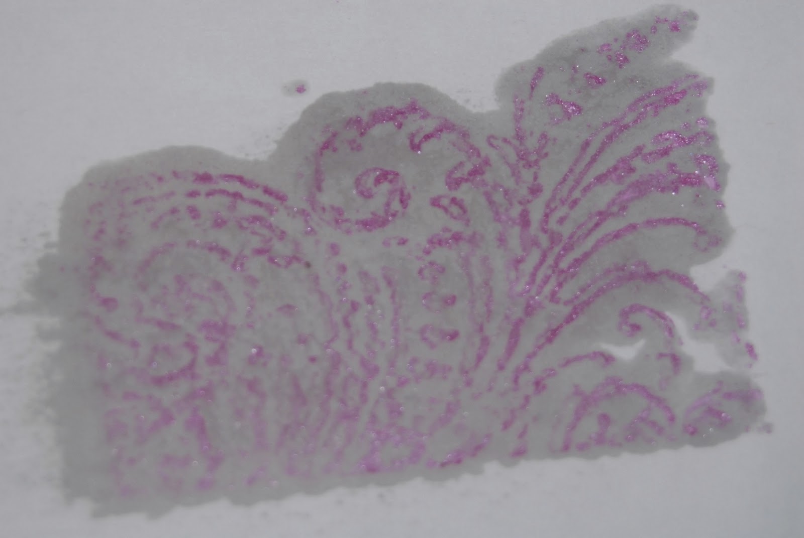
Step 5: When UTEE is completely cooled, paint over it with Creative Inspirations Paint. Here I am using Tickled Pink.  I painted my whole paper, but how much you cover is up to you.

Step 6: Let paint dry (this shouldn't take very long), then cover with your scrap paper.

 Step 7: Using a hot iron (no steam), iron over your project.

 What you are doing is melting away the UTEE. By covering it with scratch paper, you are giving it something to absorb into rather than simply making a mess.  This scrap paper could also be fun to use on a project if you wanted. =)

Step 8: Carefully peel off the scrap paper.  Don't force this step. If it doesn't peel off easily, simply heat it a little longer with the iron.

Because we are using CI paints, when this baby hits the light, it shines!

 For my finished project, I die cut the carstock into a heart.

Here is a closeup of the heart

I love that the paint is both shimmery, and packed with color! this is the same heart, just tilted slightly to hit the light

I hope you enjoy this technique, and that you all have a fabulous weekend. Don't forget to take time for yourself to be creative!

Also, I'd like to take a sec to thank my AMAZINGLY talented DT for all their hard work this past term. I'd also like to welcome the 2 new girls joining our team... Holly and Dani. They are both very talented, and I am excited to get to work with you.  

items used for my project:
Paper: White cardstock, tissue paper, DCWV
Stamps: Fancy Pants "Pollen Dust", Kaisercraft "Grid"
Ink: Colorbox "Frost White" & "Black" pigment inks
Creative Inspirations Paint: Tickled Pink
Other: Ribbon, UTEE